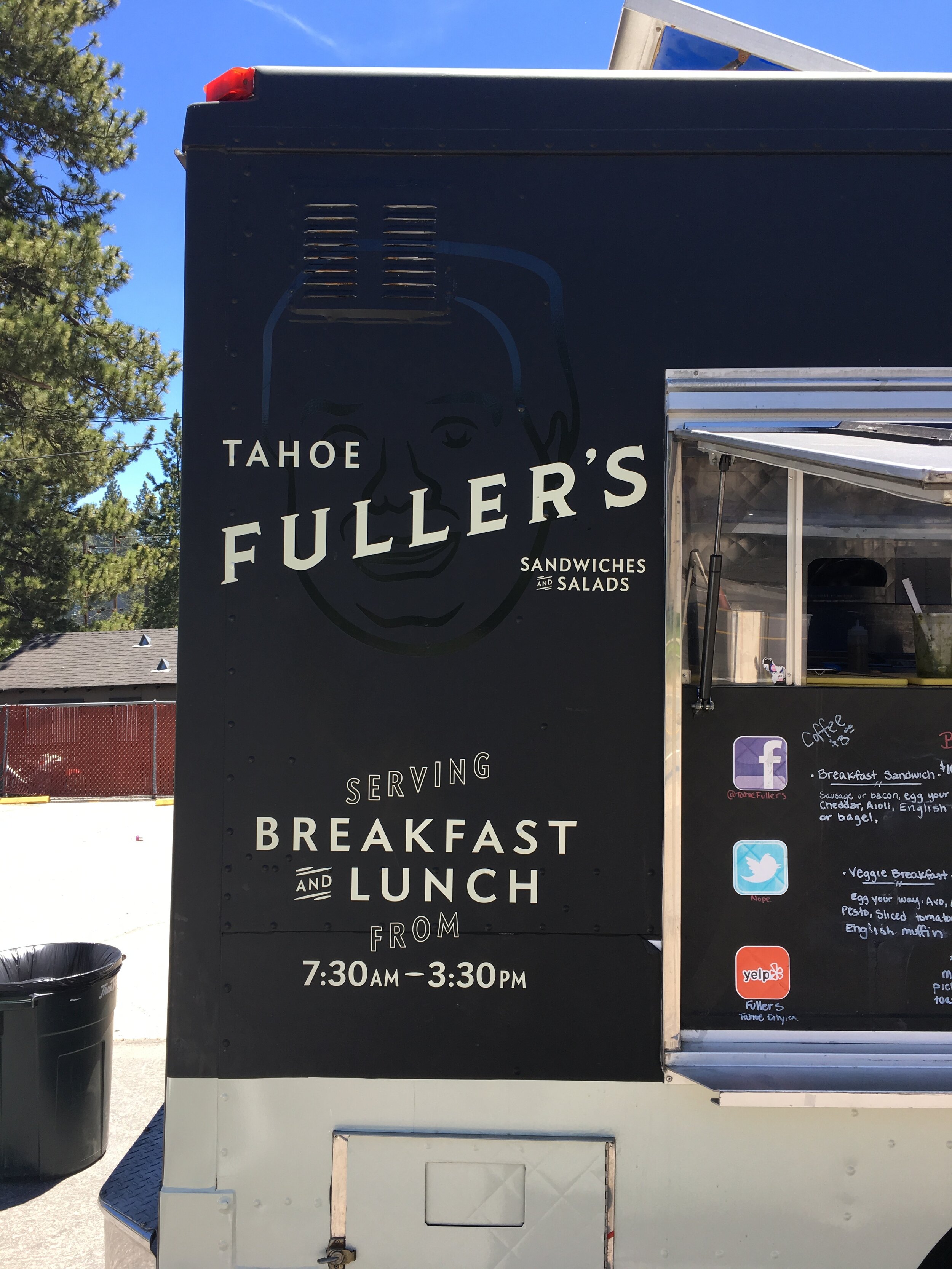
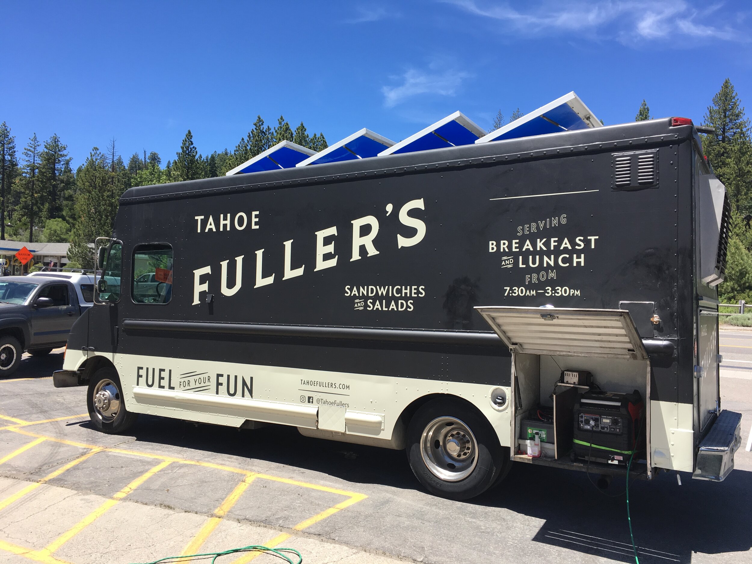
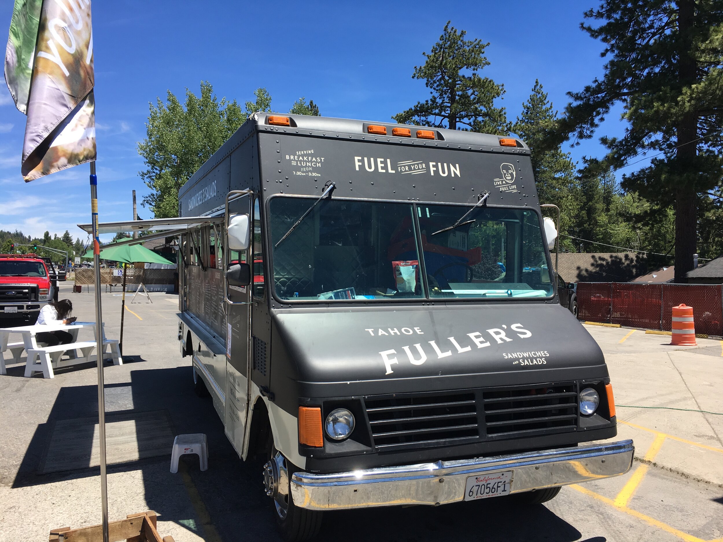
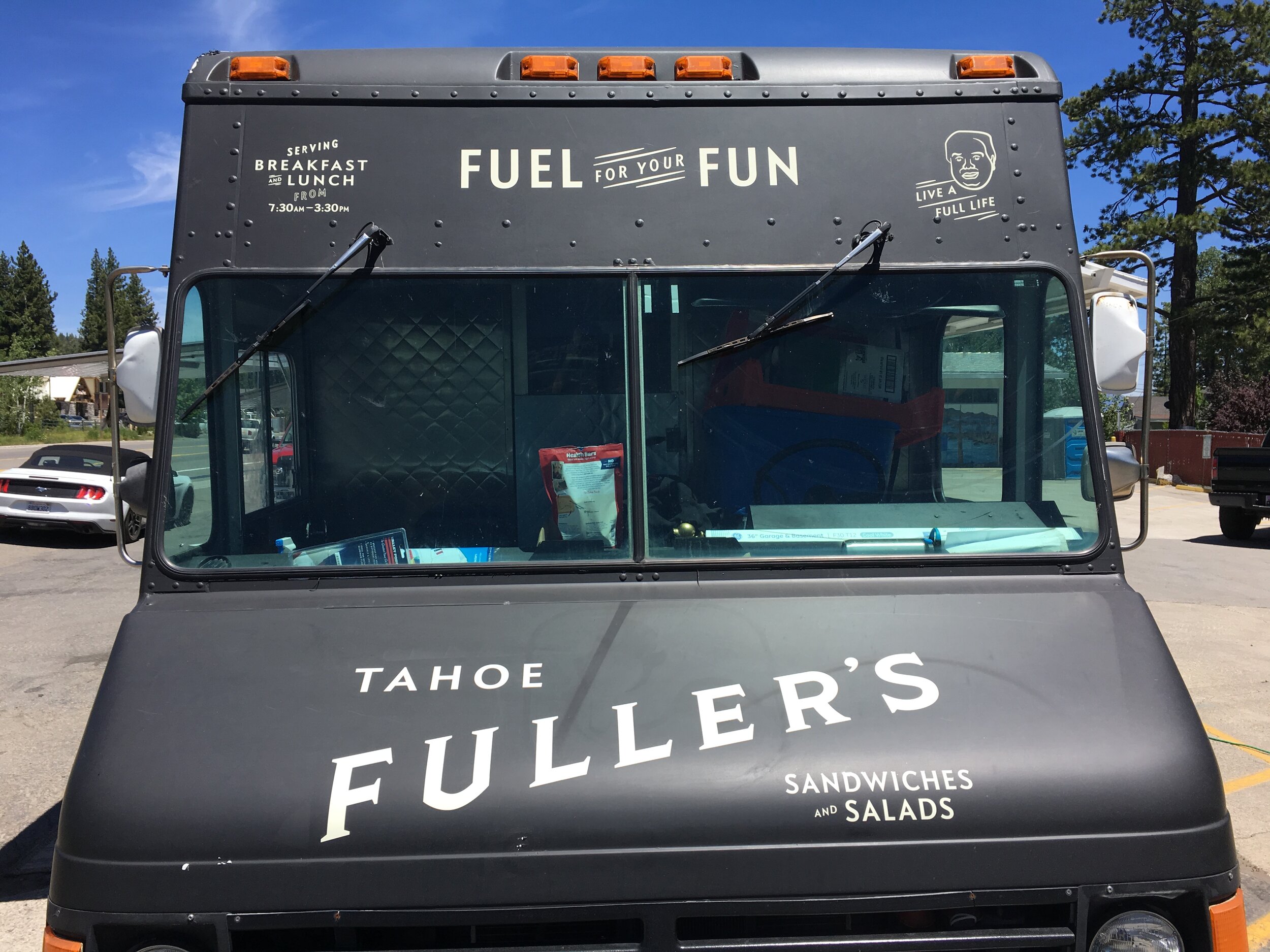
Tahoe Fuller’s

identity / print / Environmental / website


Reviving a local legend.

Mike and Meghan, local brother and sister team, saw a gap in Tahoe City—a grab and go eatery option for the family of four planning a full day on the beach, paddling the river, or hiking one of the many trails in the area. It’s quick, affordable, and most importantly, delicious.


FUL-BrandAssetsArtboard 3.png
 
 
From start to finish, Kyle was a professional yet approachable business person. He made us feel supported and heard. As co-owners, we each had a very different vision of our overall design and Kyle managed to make us both extremely happy. From the truck design, to the menu, to the website, our business is represented on such an elevated level than before Kyle got involved. We feel like we can keep up with the big dogs now.
— Meghan Rudnik, Co-Owner Tahoe Fuller's


Market Research

While there aren’t a ton of food trucks in the area, it is still important to make a strong impression and anticipate what the future might bring. I found that of the existing trucks, there were few with obvious branding or a clear message of what they serve. Through these discoveries, a few design goals emerged; be transparent, stand out, and be inviting. This led me to create a bold identity and truck wrap that would stand out both at festivals and on the street.


Fuel for Your Fun!

After talking through the menu, the target audience, and the long term goals for Tahoe Fuller’s, I concluded that we had to strike a balance between casual and gourmet. Something that looked too gourmet would come off as unapproachable, while too casual could signal another tourist trap and not communicate enough quality. The solution was to employ a restrained color palette with sophisticated lettering used in a playful manner, and light-hearted lifestyle photography.


What’s in a name?

The namesake of the business, Nick Fuller, is somewhat of a local legend, and was a prominent figure in the business community of Tahoe City, helping to shape what it is today. I wanted to make sure his story—and jovial character—was conveyed through the visual identity with a line art illustration.


Fullers-NickArtboard 4 copy 2@2x.png
 
FUL-BrandAssetsArtboard 2.png
 
 
Fullers-Logo-BLK.png


A nod to the past.

For the logo, I looked at a few directions that leaned into a classic deli aesthetic from script lettering to shadowed block letters, and finally to where I landed. The lettering solution evokes a sophisticated yet inviting tone and the other elements of the identity system lend a playful touch to the overall stark creme and black palette.


Shadowed Block Letter

Shadowed Block Letter

Script Lettering

Script Lettering


Delivering on the Design Strategy

A food truck wrap needs to be a billboard for itself. In our research, I realized that a lot of trucks don’t actually communicate what kind of food they serve—a missed opportunity when a potential diner doesn’t have a whole lot to go on. I wanted to make it very clear what Fuller’s is serving and make sure important information (such as hours of operation) was prominent to the diners. Their social media is updated constantly with their location, so it was crucial to have their handle large and visible.


Website

The website was built on Squarespace in order to offer an easy CMS interface that they could update on their own with new photography and menu items. We wanted to feature their catering capabilities as well, so that gets its own banner, located high up in the hierarchy. The hours of operation are featured on the very top of the page because let’s face it, most of us need to know when we can actually get a meal.

See the live site →


FUL-ClipboardMenu.png


FUL-BrandAssetsArtboard 2.png